Flexbox in React Native
Hey friends, welcome back to my React Native series. I hope you are enjoying this series and learning from it. So till now, we have got enough knowledge about React Native and we have created a small app to enable the Dark mode-like feature in our app. If you haven't checked that blog then I would highly recommend you to go ahead and check out my previous article for more in-depth knowledge.
Now, it's time to build a more advanced app than the previous one. So let's get started.
Flat Cards
Friends, we often see many OTT platforms keep images of trending serials or movies on the top of their apps.
We even see many social media platforms have stories feature, where we can see a couple of stories in the same row.
So what is this all? This is nothing but a set of cards that are arranged in a row. We can say them as Flat Cards.
So let's see how we can implement such a feature in our React Native app.
Before starting I would recommend you, install the below extension on VS code which will give basic code snippets to fast the development process.

So first and foremost, let's create one folder named
componentsand add all our custom components to that folder.I am creating
FlatCards.tsxfile inside thiscomponentfolder with the below basic code:import { StyleSheet, Text, View } from 'react-native' import React from 'react' export default function FlatCards() { return ( <View> <Text>FlatCards</Text> </View> ) } const styles = StyleSheet.create({})
Note: I haven't typed above code manually. As we have installed the extension, just type rnfs (react native functional stylesheet) and hit enter. Boom you got the basic code.
Now, let's import the FlatCards component in our
App.tsxfile.import { SafeAreaView, Text, ScrollView } from 'react-native' import React from 'react' import FlatCards from './components/FlatCards' const App = () => { return ( <SafeAreaView> <ScrollView> <FlatCards></FlatCards> </ScrollView> </SafeAreaView> ) } export default AppAs you see above, we have FlatCards wrapped inside the ScrollView component so that if our content exceeds the height of the device then the scroll bar will appear.
One more thing, once you start typing FlatCards, VS code with his IntelliSense shows you from where this component is going to come and it will even import it making your life so much easy.
We can define FlatCards as an opening and closing tag or we can have it defined as a self-closing tag
<FlatCards />.
Now let's create our cards inside the FlatCards component.
So guys, as of now I want to have three cards in a single row each containing popular programming languages in 2023.
  export default function FlatCards() {
    return (
      <View>
        <Text style={styles.heading}>FlatCards</Text>
        <View style={styles.container}>
          <View style={styles.card}>
            <Text>JavaScript</Text>
          </View>
          <View style={styles.card}>
            <Text>Java</Text>
          </View>
          <View style={styles.card}>
            <Text>Python</Text>
          </View>
        </View>
      </View>
    )
  }

  const styles = StyleSheet.create({
    heading: {
      fontSize: 40
    },
    container: {},
    card: {}
  })
As you can see, I have created one View which will act as a container that will contain all my cards in it.
And inside the container, I have created three Views that will act as a card each will have text inside.
For each component, I have even created styles objects accordingly. Now we will see one by one what needs to be done.
Firstly, I would like to give some height and width to our card along with the border color. Feel free to use colors of your choice.
  const styles = StyleSheet.create({
    heading: {
      fontSize: 40
    },
    container: {},
    card: {
      height: 100,
      width: 100,
      borderColor: '#23C4ED',
      borderWidth: 1
    }
  })
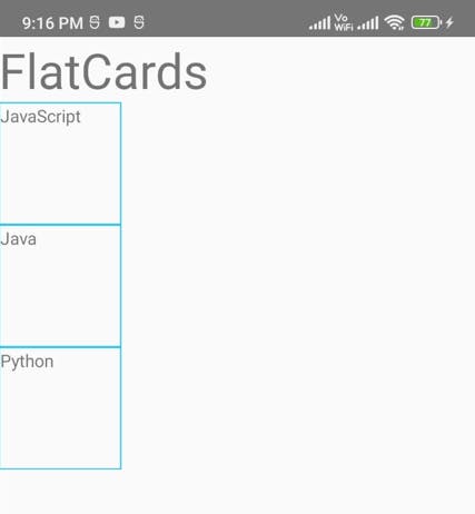
Now our app is looking like this:

As you see, we have got three cards but they are vertically aligned. I want them in a single row. So to do that, we need to add flex property to the container
flex:1.This is not going to make any changes until we add one more property i.e.
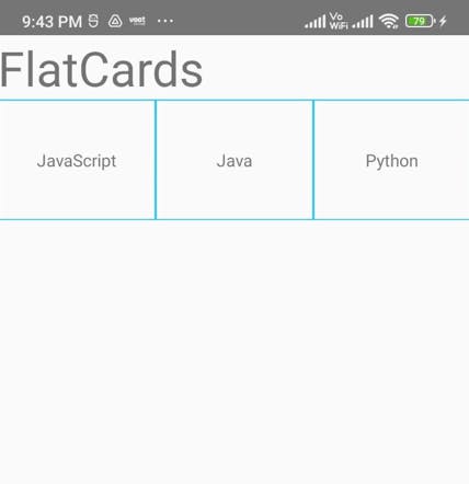
flexDirection: row. This will align our cards horizontally. Below is the result:
I would recommend you, try different values of flexDirection like (column, row-reverse, column-reverse, etc) and observe the impact on cards.
Now let's bring the text in each card at the center so I will give the below style to the card:
flex: 1, alignItems: 'center', justifyContent: 'center'Just like flexDirection, we have different values for alignItems and justifyContent like (flex-start, flex-end, space-between, space-around, etc). Try them and see what difference each value creates on the app.
And lastly, I will give margin/padding to the heading, container and card according to my observation. I have even specified a border radius for cards. You can modify the style according to your preference.
With this all, our final code will look something like this:
import { StyleSheet, Text, View } from 'react-native'
import React from 'react'

export default function FlatCards() {
  return (
    <View>
      <Text style={styles.heading}>FlatCards</Text>
      <View style={styles.container}>
        <View style={styles.card}>
          <Text>JavaScript</Text>
        </View>
        <View style={styles.card}>
          <Text>Java</Text>
        </View>
        <View style={styles.card}>
          <Text>Python</Text>
        </View>
      </View>
    </View>
  )
}

const styles = StyleSheet.create({
  heading: {
    fontSize: 40,
    paddingHorizontal: 10
  },
  container: {
    flex: 1,
    flexDirection: 'row',
    padding: 8
  },
  card: {
    flex: 1,
    alignItems: 'center',
    justifyContent: 'center',
    height: 100,
    width: 100,
    borderColor: '#23C4ED',
    borderWidth: 1,
    borderRadius: 5,
    margin: 10,
  }
})
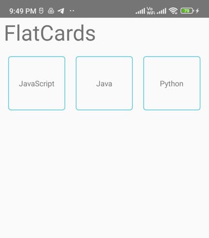
And our final result will be,

Note: Flexbox is not used just to arrange items horizontally. It is used to align items vertically, horizontally, and diagonally. We can utilize Flexbox in any way as per the requirements.
Friends, that's it for today. We will make this app more appealing in upcoming articles. But for today this is it. I hope you understood till now. Let me know in the comments section if you have any doubts. I will catch you up in the next article.
Special thanks to Hitesh Choudhary !!!